Responsive HTML5 and CSS3 Web Design: Responsive Enough? Err… Hello?!?
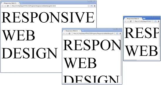
 Looking at the figure above, it would be nice if the web site displays properly in other browser sizes from other devices. Well have no fear, responsive web design is here.
So what is responsive web design? Responsive web design was coined by Ethan Marcotte. It is basically an approach to making web sites respond to the differing viewports of browsers on different devices by using 3 existing techniques:
- flexible grid layout,
- flexible images, and
- media and media queries.
One should design for the smallest viewport first then enhance for larger viewports.
If you visit this site, http://mediaqueri.es/, you will see how responsive web sites look or display at the different design “break points”. Try one of the sites there and see for yourself by changing the browser size.
Some tools to resize your browser quickly:
- In IE9, use the Developer Toolbar and go to Tools –> Resize.
- In Chrome, you can use the Developer Toolbar too but this is to emulate a device. You go to the Emulation Panel beside the Console panel, after showing the console. See Mobile Emulation.
- Alternatively, you can use a Chrome browser extension Resolution Test.
So how do HTML5 and CSS3 help in making web sites responsive? The following are some of the features in HTML5 and CSS3, just to give you an idea.
For HTML5:
- Streamlined markup and more meaningful semantic elements provide for a leaner and faster-loading code base.
- Feedback to user on form submissions negates the need for more resource heavy JavaScript form processing.
- <header><nav> replaces your usual <div class=”navigation”> section.
For CSS3:
- Use of relative measurement units (i.e. em or ems and percentages) instead of pixels.
- Media queries that targets specific CSS rules at specific viewports.
- border-radius property and background-image linear-gradient property that allow for a rounded button with gradient background image without actually using any images.
- 3D transformations that make animation lightweight, maintainable, and perfect for a responsive design, although IE9 does not support this.
- In essence, CSS3’s media queries, modules, gradients, shadows, typography, animations, and transformations pushes responsive design even further.
- Check this site, http://www.csszengarden.com/. It demonstrates what can be accomplished through CSS-based design.
This is just the first in a series of posts on responsive web design using HTML5 and CSS3. Next I’ll go into more details and more examples.