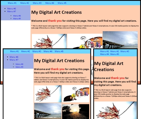
Web Design: A Fluid Layout Exercise
Using CSS media queries is one part of making your web site responsive but you are limited to specific viewports. Having a fluid layout on top of that will greatly improve the responsiveness and makes it more future proof. In CSS, you can implement a fluid layout by sizing your elements’ horizontal dimensions in proportion using percentage % rather than pixel px and your fonts’ sizes using relative measurement em.
When sizing using proportion, you need to know the context to which this measure is related to. Say you set an element’s font size to 90%. 90% of what? That what will be the context. If you have defined a font-size in the closest containing element as 20px, then it will be 90% of 20px.
If you are converting a fixed width layout to a fluid layout, the general formula used is target divided by context. Say you have an element’s width set to 10px and the containing element’s width is 100px. To convert, you divide 10px by 100px which gives us 10% and that will be the resulting element’s proportional width.
Images can be fluid too by taking the same logic as with the elements. Also worth knowing is that you can set a maximum width that these images (and even elements) can go up to in case you don’t want them to get very, very big.
Another way of making images fluid is by resizing these images on the server before it is rendered to the browser. This also saves bandwidth spaces for bandwidth challenged devices. This I will not cover here.
Also, there is a rapid or quick way of making a web site fluid by using a grid system. One example of a grid system is Bootstrap. This I will not cover too.
For this exercise, I have 2 sites, one with non-fluid layout and another with a fluid layout. Both of these use CSS media queries. I only have listed below the fully commented CSS for the fluid layout web site. The HTML source you can view from the browser and the non-fluid CSS should be the same name except for the CSS extension (*.css instead of *.html).
/* When converting from fixed width to fluid, the general formula used is: divide target by context. */
body {
  font-family: Calibri;
  font-size: 100%; /* 16px is the default font-size for most browsers. It's equal to 1em and equal to 100%. 16px will be the context for our proportional fonts. */
}
div {
  padding-top: 3px;
  padding-bottom: 3px;
  padding-left: 0.5%; /* divide 5px by 960px */
  padding-right: 0.5%;
}
ul,
p {
  margin-top: 0px;
  margin-bottom: 0px;
}
a {
  text-decoration: none;
}
h1 {
  font-size: 2.125em; /* divide 34px by 16px */
}
h2 {
  font-size: 1.1875em;
}
h2 span {
  color: Red; /* The context for span is h2. span's pixel font size is 22px and h2's is 19px. So to get the proportional font-size of span, we divide 22px by 19px, not 16px. */
  font-size: 1.157em;
}
h3 {
  font-size: 0.75em;
} /* #wrapper width's pixel size is 960px. This will be the context for our proportional elements. Note that I did not exactly follow the formula's result to the decimal point. As long as it's approximate and everything tallies exactly to 100% of their containing element, it should be fine. */
#wrapper {
  margin-top: 10px;
  margin-right: auto;
  margin-left: auto;
  padding-left: 0px;
  padding-right: 0px;
  width: 100%; /*max-width: 960px;*/ /* if you don't want to scale out beyond some point then set max-width */
}
#header {
  margin-right: 1%;
  margin-left: 1%; /* For the width, divide 930px by 960px. But I rounded it to whole number for easy maintenance. Just need to make sure everything tallies to 100%. 97% for the header content's width, 2% total for it's left and right margins. And don't forget we have padding of 1% total for both sides of a div. So that makes a 100%. */
  width: 97%;
  background-color: #6fd7ff;
}
#navigation ul li {
  display: inline-block;
  margin-right: 2.5%;
} /* Note that the anchor tag does not have explicit context. So the right margin is moved to the containing li tag (above). */ /*#navigation ul li a { margin-right: 25px; }*/
#sidebar {
  margin-left: 1%;
  float: left;
  background-color: #9fade6;
  width: 20%;
}
#sidebar ul {
  margin-top: 10px;
}
#sidebar ul li ul li a {
  font-size: 0.875em;
}
#content {
  margin-right: 1%;
  float: right;
  width: 76%;
  background-color: #ffcdaf;
}
#footer {
  margin-right: 1%;
  margin-left: 1%;
  clear: both;
  background-color: #cc6444;
  width: 97%;
}
#footer p {
  font-size: 0.75em;
}
.art {
  width: 32.5%;
}

/* Below are the breakpoints, 604px and 320px. */

/* I put addtl breakpoint here and set the page to fixed width so sidebar text won't wrap */
@media screen and (max-width: 665px) {
  #wrapper {
    width: 665px;
  }
}

@media screen and (max-width: 604px) {
  #wrapper {
    width: 99%;
  }
  #sidebar {
    width: 33%;
  }
  #content {
    width: 63%;
  }
  .art {
    width: 49%;
  }
}

/* I put addtl breakpoint here and set the page to fixed width so sidebar text won't wrap */
@media screen and (max-width: 412px) {
  #wrapper {
    width: 412px;
  }
}

@media screen and (max-width: 320px) {
  #wrapper {
    width: 99%;
  }
  #sidebar {
    display: none;
  }
  #content {
    float: none;
    margin-left: 1%;
    width: 97%;
  }
  .art {
    width: 100%;
  }
}
