Using CSS Media Queries
 CSS media queries allows your site to be responsive by changing the styles and layout when viewed from different devices such as mobile devices.
Before media queries, web developers resort to creating a separate web site for mobile viewing. With media queries you don’t have to anymore. So what do media queries look like and how do you use them?
Media queries extend the existing media types, such as the screen and print, that HTML4 and CSS2 supports.
<link rel=“stylesheet” type=“text/css” media=“screen” href=“screen.css”>
It queries the media type for conditions, capabilities or features. In the example below it asks the screen if it is in portrait orientation, and if it is, asks it to load the stylesheet portrait-screen.css.
<link rel=“stylesheet” media=“screen and (orientation: portrait)” href=“portrait-screen.css” />
But the best way to use media queries is within CSS stylesheets using @media.
@media screen and (max-device-width: 400px) { h1 { color: green } }
CSS @import can also be used to conditionally load stylesheets, but, just like the tag, it adds to HTTP requests.
@import url(“360maxwidth-screen.css”) screen and (max-width: 360px);
The most commonly used media features are width, which is the device’s viewport width, and device-width, which is the device’s screen width. And you can prefix min and max to almost all of the media features to define a range (e.g. min-width and max-width).
Below is the formal syntax definition of media queries:
media_query_list: <media_query> [, <media_query> ]* media_query: [[only | not]? <media_type> [ and <expression> ]*] | <expression> [ and <expression> ]* expression: ( <media_feature> [: <value>]? ) media_type: all | aural | braille | handheld | print | projection | screen | tty | tv | embossed media_feature: width | min-width | max-width | height | min-height | max-height | device-width | min-device-width | max-device-width | device-height | min-device-height | max-device-height | aspect-ratio | min-aspect-ratio | max-aspect-ratio | device-aspect-ratio | min-device-aspect-ratio | max-device-aspect-ratio | color | min-color | max-color | color-index | min-color-index | max-color-index | monochrome | min-monochrome | max-monochrome | resolution | min-resolution | max-resolution | scan | grid
CSS media queries from Mozilla Developer Network lists all the media features available with examples and also explains the formal syntax definition.
To illustrate the benefits of using media queries, open this page https://rodansotto.github.io/projects/css/fixedwidth.html in your choice of browser. It is a classic example of a web page using the 960 grid system, which by the way, is a popular fixed grid layout system used by web designers for years. It has 960px total width, 10px left and right margin, and 940px total content area. If you continually resize your browser to decrease the width, it will just continue clipping the content. If you view it on a mobile device, it will show the whole page but scaled down. If it shows the page at 100 percent, still the content is clipped.
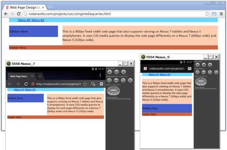
If I want the page to display nicely, say on a Nexus 7 tablet with 800 width resolution and a Nexus S smartphone with 480 width resolution, I need to add the following media queries to my CSS.
/* Nexus 7 tablet styles/layout /
@media screen and (max-width: 604px) {
}
/ Nexus S smartphone styles/layout /
@media screen and (max-width: 320px) {
/ … */
}
Notice that the above media queries target a screen width of 604px for Nexus 7 instead of 800px. This is because the ratio between the pixels you know, which is device-independent pixels, and the Nexus 7 device’s pixels is not 1:1 but 1.325:1. For Nexus S it’s 1.5:1.
https://rodansotto.github.io/projects/css/usingmediaqueries.html displays the same page but using media queries so you can view the site nicely on a Nexus 7 and Nexus S devices. If you don’t have any of these devices, you can resize your browser to decrease the width and notice how the page changes it’s layout at 604px and at 320px browser width. You can view the HTML code from your browser when you right-click and select View page source or View source. For CSS code, just use the same URL but with .css as the file extension instead of .html.
In conclusion, it’s nice and all having media queries available to make sure your site is displayed nicely on mobile devices. But this is just a step in the right direction towards having a responsive web design. Media queries can only get you as far as changing the styles and layouts for specific widths or viewports and anything in between you will still have the problem with content being clipped. And this is where fluid layout comes in, which will be covered on the next post.